Hi and welcome to this very short video on Foglight Evolve and our new container monitoring capabilities for Kubernetes and Docker Swarm. We're going to go ahead and jump straight in to Foglight Evolve to show just a little bit about what we're collecting for both of these great new technologies. On the screen right now, we're in Foglight Evolve looking at Kubernetes. And I'm actually looking at a particular cluster within my Kubernetes environment.
Here I can see usage rate for CPU and memory. I can drill into our topology, and I can start very quickly diving into exactly what's running in my environment. I can see the pods that're running, the services that they're supporting, and within each click on any of these, I can see exactly the pods and what they're doing, as well as the metrics they're collecting. If I click Explore, I can get into a deep dive view of this particular pod. And by clicking Metric Selector, I can very quickly come in and change all the metrics that I'm looking at.
So if I want to change the time window, I can easily do that up here. So like, the last one hour-- and we'll change that what we're looking at. And if I want to change my charts, Customize is sitting right here to allow you to change this to stacking area chart, as well as being able to change it from average to min to max to sum and min-max max as well, so providing the flexibility to see the metrics you want the way you want them to.
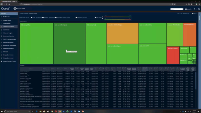
Now lastly, I want to show our ability to use visual analytics to make managing environment just a little bit easier. So I'm actually going to drill into the heat map view here. And what we're actually seeing on the screen right now is a heat map based on Kubernetes pods across all namespaces in all clusters. I can very easily come in here and change my cluster to the one we were looking at just before and configure the metrics, as well, that control the size as well as the color.
In this example, we're looking at network transfer rate and memory usage by color. Maybe I want to see the network transfer rate, and I want to pivot that by CPU usage. So now immediately, I can see here is a high CPU usage pod. But all of these are quite high, in terms of network transfer. We built this explicitly for helping users manage environments with hundreds and hundreds and hundreds of community pods running, to try to very quickly narrow down exactly who's driving what network or CPU or other limited resources usage in the environment. So if you'd like to know more, visit Quest.com/Foglight. And thanks for watching.
 03:03
03:03